It’s here! Typographic Matchmaking hot off the press
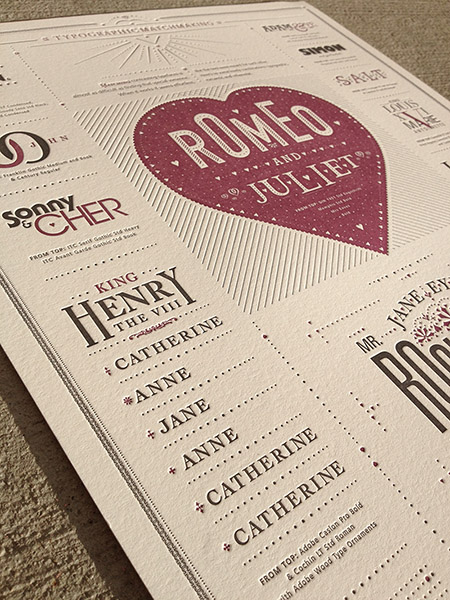
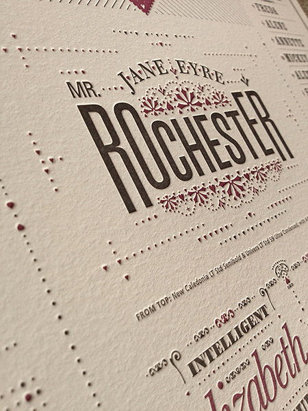
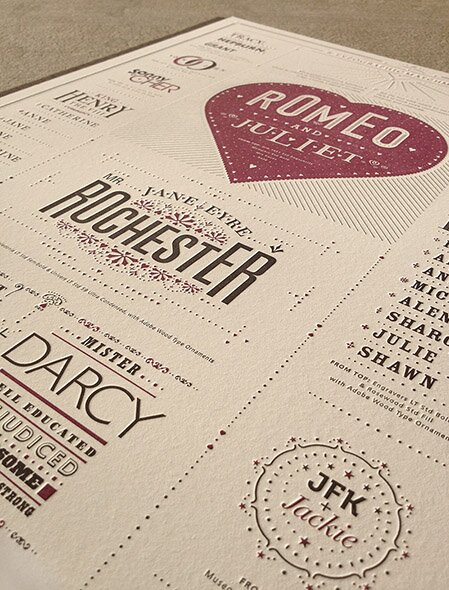
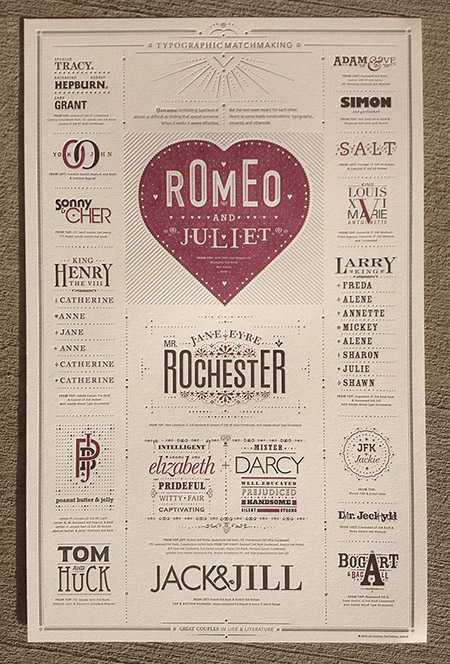
Remember that scene from Fiddler on the Roof when Tevye’s daughters long for the matchmaker to “Find me a find, catch me a catch”? Well, matching contrasting typefaces is almost as difficult as finding that special someone. When it works it seems effortless, like the two were meant for each other. Jim Godfrey created the Typographic Matchmaking poster (shown below) out of a desire to share with others some type combinations that work well together. To make it interesting, he thought it would be fun to highlight famous combinations from history, literature and life.

For the next 16 weeks, we’ll be posting one type combination per week from Jim’s poster. There will be additional information about both the combinations and the typefaces. The content and design of the site is authored by Jim Godfrey, with Rowley Press hosting the site.
Buy the poster
The poster is available for purchase. A first edition of 75 has been printed. Each poster is $65 and is signed and numbered by Jim.
Tell us what you think
We’re sure there are those who may disagree with Jim’s choices. That’s one of the great things about typography: it’s personal and subjective. Feel free to make comments on the Resources page regarding the typefaces you like to combine. It’s intended to be a forum to discuss thoughts on combining type.
Why Combine Typefaces?
One question might be “Why use different typefaces, why not use just different weights or styles of type?” Well, that works, too, but sometimes a designer might want to create more interest or contrast in his/her design. Trying to combine different typefaces is sometimes daunting, as it takes a lot of practice and experimentation. If you need help, check out the resources section for some articles to read.
Leave a Reply
- Recent posts:
- Great Article from Typography.com
- New Trend: typefaces create their own matchmaking
- The New Archer Meets Its Match. Several of Them, Actually.
- Matching Typefaces to Logo Designs
- Becoming a Matchmaker: How to Combine Typefaces Effectively, part 3 of 3
- Becoming a Matchmaker: How to Combine Typefaces Effectively, part 2 of 3
- Becoming a Matchmaker: How to Combine Typefaces Effectively, part 1 of 3
- Post-Valentine’s Day Post


