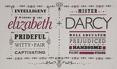
Poster Details: Elizabeth & Darcy
Baskerville + Gill Sans
[ Baskerville Std Italic, Gill Sans Std Light ]
Movie adaptations of Jane Austen’s Pride and Prejudice abound. But typefaces like Baskerville and Gill Sans are one of a kind. John Baskerville created the elegant and refined Baskerville in 1752, the perfect typeface to depict Elizabeth Bennet. Though unappreciated in its time in England, Giambatista Bodoni (see next week’s entry) was inspired by the typeface, as were others on the continent. I love the curves and the beauty of the italic version. The same sense of stately refinement is found in Gill Sans, especially in the regular and light weights (the heavier weights get a little funky). Eric Gill, a fellow Brit, used the type Edward Johnston created for the London Underground as a basis, but Gill Sans has its own unique characteristics. Created from 1928 to 1930, Gill Sans is a bit more condensed and the lowercase letters are much more refined. I’ve set “DARCY” in all caps because of the formal propriety he exudes in the novel.
I’ve also used quite a few more typefaces to accentuate each character’s qualities. They are set in many different faces and probably feel similar to Victorian posters created in the 1800s. With the advent of the industrial revolution, the need to sell large quantities of goods and to let city-dwellers know about events meant that posters proliferated as a way to advertise. To get the attention of passersby, type foundries began to create unique and interesting typefaces, cut out of wood due to their large size. Many of the types I’ve used, however, date to the 20th century, perhaps an example of something not being quite what it appears. Isn’t that a theme from Jane Austen’s novel, too?
List of the typefaces for Elizabeth (top to bottom):
Bodoni Std Poster, Baskerville Std Italic, ITC Cheltenham Ultra Condensed, ITC Leawood Std Book, Copperplate Gothic Bold
List of the typefaces for Mr. Darcy (top to bottom):
Rockwell Std Bold Condensed, Gill Sans Std Light, Bodoni Std Poster, Gill Sans Std Shadowed, Full-faced Grecian, Polar Std Black, Antique Tuscan Condensed.
List of ornaments and glyphs used (in no particular order):
Adobe Garamond Pro, Bodoni Ornaments ITC and Type Embellishments One LET
Want to impress a Jane Austin lover?
Mention that Mr. Darcy’s first name is Fitzwilliam
Want to impress a designer?
Mention that Mrs Eaves was John Baskerville’s mistress and the namesake for the typeface designed by Emigre’s Zuzana Licko.
Sources:
Meggs’ History of Graphic Design by Philip Meggs and Alston W. Purvis, 4th edition, published by J Wiley & Sons.
Type: The Secret History of Letters by Simon Loxley, First Edition, published by I. B. Tauris.
My wife, a first-rate Jane Austin lover
Leave a Reply
- Recent posts:
- Great Article from Typography.com
- New Trend: typefaces create their own matchmaking
- The New Archer Meets Its Match. Several of Them, Actually.
- Matching Typefaces to Logo Designs
- Becoming a Matchmaker: How to Combine Typefaces Effectively, part 3 of 3
- Becoming a Matchmaker: How to Combine Typefaces Effectively, part 2 of 3
- Becoming a Matchmaker: How to Combine Typefaces Effectively, part 1 of 3
- Post-Valentine’s Day Post
