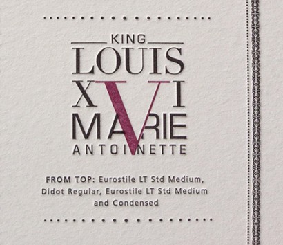
Poster Details: King Louis XVI & Marie Antoinette
Eurostile + Didot
[ Eurostile LT Std Medium, Didot Regular, Eurostile LT Std Medium and Condensed ]
Although they would never be mistaken for a “romantic” couple (rumors abounded about Marie’s possible lovers), the deaths of King Louis the 16th and Marie Antoinette make it hard to think of one without the other. A tidal wave of outrage and cry for freedom occurred in France in 1792, leading to their beheading 8 months apart. At about this same time, fellow Frenchman Firmin Didot was participating in a typographic revolution. A contemporary of Giambatista Bodoni, the two were familiar with one another’s work and each created a “Modern” type in the late 1700s that shared the characteristics of hairline, unbracketed serifs, high contrast between thick and thin strokes and a formal, geometric, mathematical preciseness to the letterforms.
Eurostile was designed a couple of centuries later by Italian Aldo Novarese. He and Alessandro Butti had designed a similar typeface named Microgramma in 1952, but only created capital letters. In 1962, he created a lowercase to the typeface, which was named Eurostile. It shares a formal, mathematical structure with Didot. It also feels a little cold and distant, an attitude shared by the King and Queen toward their subjects.
Typefaces similar to Eurostile:
Bank Gothic, Square 721 (also designed by Aldo Novarese), Olney, Gamba.
Typefaces similar to Didot:
Didot (from Hoeffler Frere-Jones), Bauer Bodoni, Filosofia, and Fenice, FF Cellini, Walbaum.
Sources:
http://www.pbs.org/marieantoinette/
http://adobe.com
http://identifont.com
20th Century Type Designers by Sebastian Carter, published by W.W. Norton & Company, 1995.
Leave a Reply
- Recent posts:
- Great Article from Typography.com
- New Trend: typefaces create their own matchmaking
- The New Archer Meets Its Match. Several of Them, Actually.
- Matching Typefaces to Logo Designs
- Becoming a Matchmaker: How to Combine Typefaces Effectively, part 3 of 3
- Becoming a Matchmaker: How to Combine Typefaces Effectively, part 2 of 3
- Becoming a Matchmaker: How to Combine Typefaces Effectively, part 1 of 3
- Post-Valentine’s Day Post
