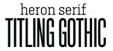
Weekly Combo: Heron + Titling Gothic FB
Today marks the beginning of the weekly type combo. Each week, I’ll post a new combination of typefaces that I think are a match made in heaven. Or that at least work well together. Feel free to suggest your own, just comment below. You’re also welcome to tell me why you feel a combination I’ve chosen doesn’t work.
This week’s combo:
Heron Serif and Titling Gothic are both made by Font Bureau. Heron has the feel of a modern slab serif, while Titling Gothic’s letterforms are akin to san serifs from the 19th century (the web site states it was inspired by ATF’s Railroad Gothic). The letterforms feel modern, particularly the condensed weight used here, with just a subtle nod to the eccentricities of the late 1800s early 1900s (look at the capital C). Both are part of vast type families; Heron comes in 20 weights and styles, and Titling Gothic 50.
Designers:
Heron: Cyrus Highsmith
Titling Gothic FB: David Barlow
Where to buy:
Font Bureau
Leave a Reply
- Recent posts:
- Great Article from Typography.com
- New Trend: typefaces create their own matchmaking
- The New Archer Meets Its Match. Several of Them, Actually.
- Matching Typefaces to Logo Designs
- Becoming a Matchmaker: How to Combine Typefaces Effectively, part 3 of 3
- Becoming a Matchmaker: How to Combine Typefaces Effectively, part 2 of 3
- Becoming a Matchmaker: How to Combine Typefaces Effectively, part 1 of 3
- Post-Valentine’s Day Post
