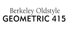
Weekly Combo: Geometric + Berkeley
One of my favorite type combinations involves a couple of typefaces with some subtle but unique quirks: Geometric 415 and ITC Berkeley Old Style. The pointed tips of the strokes on some of the capital letters in Geometric (M, N for instance) and the angle of the edge of the strokes on some of the lowercase letters (t, f) provide some uniqueness. The uppercase G is beautifully designed. Berkeley has some serious slow-burning funk going on: The bowed strokes on the letter x, the slightly tapered strokes on each letter (look at the horizontal stroke of the uppercase L and E for instance), the petite slab serifs. Overall the letterforms have a light, airy feel that contrasts well with the heavier weight and letterforms of Geometric 415. If you examine the lighter weights of Geometric, you can see that the counter spaces are quite open. This similarity, along with the subtle quirks of each face is what breeds some unity and helps the types work well together. Incidentally, Geometric was designed by W.A. Dwiggins in 1929, Berkeley (originally California) was designed by Frederic Goudy in 1937.
Designers:
Geometric: W.A. Dwiggins
Berkeley (originally called California): Frederic Goudy, redesigned by ITC
Where to buy:
www.myfonts.com
Leave a Reply
- Recent posts:
- Great Article from Typography.com
- New Trend: typefaces create their own matchmaking
- The New Archer Meets Its Match. Several of Them, Actually.
- Matching Typefaces to Logo Designs
- Becoming a Matchmaker: How to Combine Typefaces Effectively, part 3 of 3
- Becoming a Matchmaker: How to Combine Typefaces Effectively, part 2 of 3
- Becoming a Matchmaker: How to Combine Typefaces Effectively, part 1 of 3
- Post-Valentine’s Day Post
