Weekly Combo: Type Matrix No. 2
Last post I reminded everyone of the Type Matrix that appeared in a 1992 issue of U&lc (for more information about the publication check out this article on fonts.com) I also promised to look at some of the combinations shown in the matrix. Here’s the first in a series of 3 additional posts.
The type matrix compared display text and body text and indicated a 1 (Combine at Will), 2 (Not a Conservative Choice), or 3 (Think Again) to indicate which pairs were most compatible. Some of the typefaces are a bit passe (Avant Gard, Bauhaus, Souvenir, Korinna, Quorum). But below are a few selections that I’ve created from the matrix. All of the body text is 11-point Caslon 540 (one of my favorite versions). The display faces are set in 18-point type.
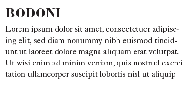
B O D O N I & C A S L O N
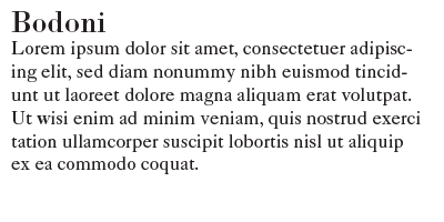
Matrix: 2 (Not a Conservative Choice)
Typographic Matchmaking: I agree. It kind of works, but looks a little awkward. A couple of things have been adjusted to make them more compatible. First I added some leading to Caslon, then some space in between Bodoni and Caslon. Finally, by making Bodoni uppercase, choosing the bold weight and adding some letter spacing, the two typefaces actually work well together.
C H E L T E N H A M & C A S L O N
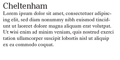
Matrix: 2 (Not a Conservative Choice)
Typographic Matchmaking: I agree. It is usually difficult to combine two serif faces together, although it can work as we saw above with Bodoni. Below, the combination has been modified by choosing the bold weight of Cheltenham. Addings some leading to Caslon as well as some space between Cheltenham and Caslon improves the aesthetic. With Cheltenham’s heavier weight, including the heavy serifs, the two look just fine together.
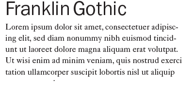
F R A N K L I N G O T H I C & C A S L O N
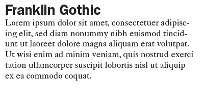
Matrix: 1 (Combine at Will)
Typographic Matchmaking: I couldn’t agree more. This is one of those classic combinations that has been used forever. The demibold weight used above contrasts nicely with Caslon. Ben Franklin loved Caslon’s types and used them in the United States (William Caslon was English). Franklin Gothic was designed by Morris Fuller Benton in the early 20th century, and is named after Ben. Below is something a little different: using the book weight of Franklin Gothic but changing the point size to 26, and, like the examples above, adding more leading.
G A R A M O N D & C A S L O N
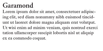 Matrix: 2 (Not a Conservative Choice)
Typographic Matchmaking: I have to take issue with this one. I’ve chosen the semibold weight of Adobe Garamond to try and help, but still don’t see a good combination. The two typefaces are too similar.
Next post I’ll pick a different text face and examine a few of the combinations like we did here. If you have any thoughts on the Caslon combinations above, or on the type matrix, comment below.
One Response
Leave a Reply
- Recent posts:
- Great Article from Typography.com
- New Trend: typefaces create their own matchmaking
- The New Archer Meets Its Match. Several of Them, Actually.
- Matching Typefaces to Logo Designs
- Becoming a Matchmaker: How to Combine Typefaces Effectively, part 3 of 3
- Becoming a Matchmaker: How to Combine Typefaces Effectively, part 2 of 3
- Becoming a Matchmaker: How to Combine Typefaces Effectively, part 1 of 3
- Post-Valentine’s Day Post

[…] with regards to in which as well as tips on how to employ trådløs boligalarm med kamera, visit my homepage,, you possibly can e mail us with the web […]