Bi-Weekly Combo: Copperplate Gothic and Helvetica Condensed
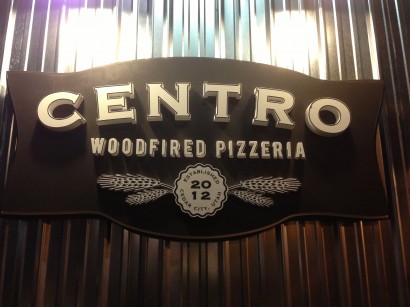
A few weeks ago my wife and I spent some time in Cedar City, Utah. On the walk to our hotel after seeing The Tempest, part of the Shakespearean festival held each year in that city, I walked by this restaurant and enjoyed the typography of the logo. It’s a nice combination of Copperplate Gothic and what looks like Helvetica Condensed Bold (although other possible suspects are Trade Gothic and ITC Franklin Gothic Demi Compressed). Any of those three san serifs would look good with Copperplate, which has seen a bit of a revival of late. I feel like it fell out of style from 1998 to about 2010, but I am starting to see it more frequently again.
Who Designed Copperplate?
It was designed by Frederick Goudy, one of the first prolific American type designers, in the early 1900s. It is kind of a san serif with petite little serifs–the “jumbo shrimp” oxymoron of typefaces–but I think it’s easy to see the influence of the san serifs of the time on the design of this typeface. It pairs really well with most any san serif. Kudos to whoever designed the logo. It’s a nice mark and I enjoy the three-dimensionality of the type on the sign.
Chalk it up to–uh, chalk.
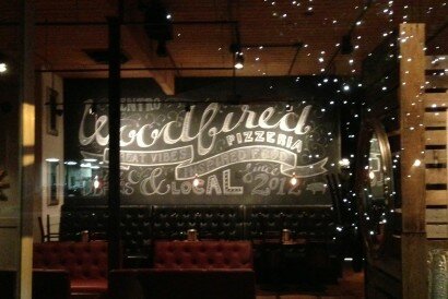
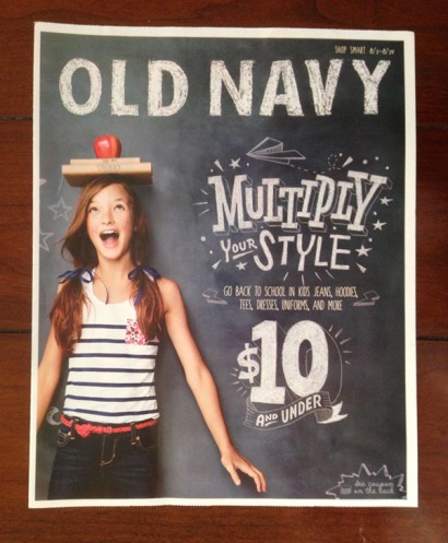
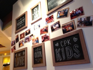
As I walked by the window, I also noticed some interesting typography created with chalk, coupling cursive text with a san serif. I thought it was pretty well done. This seems to be a common trend. A couple of posts ago, I wrote about similar type that I found at Denny’s. This week I saw it on an Old Navy insert as well as on a chalkboard at California Pizza Kitchen.
Old Navy has a nice mix of hand-crafted type based on a bold san serif (inspired by their logo), a slab serif, and a hand done san serif. The mix works well and I guess the chalk motif works for back to school. It is a bit cliche, but at least it is well done and the type treatment feels unique–its not kids’ handwriting with a few letters scrawled backwards.
As for the hand crafted type at Centro and CPK, I think it is interesting that their employees are picking up on type trends. I don’t know who created the type at Centro, but my wife spoke with the waiter who created the type at CPK. He had studied some graphic design at a nearby university and knew enough to create a nice contrast by adding a heavier outline and a drop shadow to the larger text and contrasted that with the smaller CPK. They look like they are based on the same san serif.
At any rate, look around and I think you’ll begin to see some nicely hand-comped type, based on typefaces (as opposed to looking like everyday handwriting). It’s an interesting trend.
2 Responses
Leave a Reply
- Recent posts:
- Great Article from Typography.com
- New Trend: typefaces create their own matchmaking
- The New Archer Meets Its Match. Several of Them, Actually.
- Matching Typefaces to Logo Designs
- Becoming a Matchmaker: How to Combine Typefaces Effectively, part 3 of 3
- Becoming a Matchmaker: How to Combine Typefaces Effectively, part 2 of 3
- Becoming a Matchmaker: How to Combine Typefaces Effectively, part 1 of 3
- Post-Valentine’s Day Post


[…] Source […]
Thank you very much for a high-class article