Holiday Typography, part 3 of 3
Part 3 of 3
Here’s the last entry in a three part series about creating holiday type. Last time we talked about elegant simplicity.
Informal Beauty
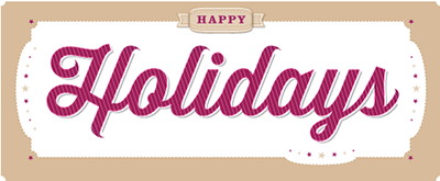
Script type seems to go well with the holidays. Above is Thirsty Script paired with Clarendon. The script provides a personal touch to the type while still retaining some subtle formal elements. I’ve added some subtle stripes to create a nod to candy canes. Clarendon is a blocky serif that provides a nice contrast to the beautiful curves in Thirsty.
One thing you’ll notice is that I modified some of the finials (ends of the strokes) in the letters H, l, d and s. I wanted to soften the blunt endings and so I added a curve that ends in a point. Again, this creates a nice contrast with the blocky elements of Clarendon as well as the thicker strokes present in Thirsty Script.
There are a lot of script typefaces to choose from. Thirsty is a new typeface, designed in 2012 by Ryan Martinson. I found it on myfonts.com. It has a number of excellent features: alternate letterforms, multilingual characters, ligatures, and some beautiful shadows, which I’ve also used.
Clarendon has been around since the 1800s in various forms. I’ve used Clarendon LT Std, which is available from Adobe.
Below is a progression of the design. Happy Holidays!
 Above: Thirsty Script with Shadow
 Above: Thirsty Script with Shadows and Stripes
 Above: Thirsty Script with Clarendon
Above: Final typography before modifying the finials
Above: Final typography
Leave a Reply
- Recent posts:
- Great Article from Typography.com
- New Trend: typefaces create their own matchmaking
- The New Archer Meets Its Match. Several of Them, Actually.
- Matching Typefaces to Logo Designs
- Becoming a Matchmaker: How to Combine Typefaces Effectively, part 3 of 3
- Becoming a Matchmaker: How to Combine Typefaces Effectively, part 2 of 3
- Becoming a Matchmaker: How to Combine Typefaces Effectively, part 1 of 3
- Post-Valentine’s Day Post


