Becoming a Matchmaker: How to Combine Typefaces Effectively, part 1 of 3

Note: This is the first in a three-part series about techniques for matching typefaces.
A H O L L Y W O O D E N D I N G
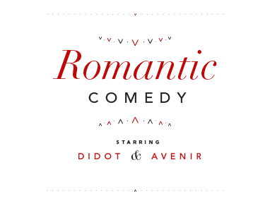
A woman is attracted to a man. Or rather, she thinks she is attracted to him. They are engaged to be married before she realizes that they are not a good match and the person she really loves is the fiance’s best man. A man whom she initially could not stand. If we had 10 dollars for every romantic comedy that follows some variation of that plot then we’d be—well, as rich as a Hollywood film studio. Interestingly, matching typefaces often works the same way: we throw two typefaces together, they seem at first glance to match, but after closer inspection we realize that there is a better, more compatible match that we had previously not considered. So, how do you find a good match? Popular advice on mixing typefaces usually consists of something like this: mix serifs with san serifs and vice versa. This is good advice, but hardly exhaustive or concise. In reality, each designer must cultivate his/her own design sensibilities. Below are a few things that may help those embarking on or in the midst of finding typographic soul mates. When deciding which typefaces to combine, there are some factors to consider that will affect your choices. These can be divided into two main categories:
- Practical considerations
- Aesthetic considerations
G E T T I N G P R A C T I C A L
Let’s tackle the more finite aspect of practical considerations. The first item to consider is readability and legibility. How readable do both typefaces need to be? If readability is a prime concern, one’s choices would gravitate towards typefaces that are free from complexity and ornamentation, typefaces whose letterforms more closely match those we learned when we began copying letterforms in kindergarten. Need a few suggestions? For the serifs: Adobe Garamond (some say this matches anything), Caslon, Goudy, Bembo, Baskerville, Century Schoolbook, Sabon, to name a few; the sans: Helvetica Light, ITC Franklin Gothic, Frutiger, Univers, Myriad (if only it weren’t the default typeface for Adobe’s Creative Suite).
Who is reading?
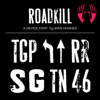
Next, consider your audience. Are you targeting teenagers, who are more flexible and accepting of unique communication? Or 7-year olds with limited reading abilities? The latter would feel more comfortable reading typefaces that closely resemble traditional letterforms. The teens, well, they could fall in love with just about anything. Content and subject matter also affect our choices. A traditional invitation to a black tie gala event would probably not work with a grungy, textured typeface like DF Roadkill (see Figure 1).
Figure 1.
Can I get your bags for you?
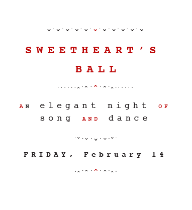
Some typefaces also carry typographic baggage, meaning that a typeface has been created for a certain genre that makes it hard to use in a new context. For instance, take the typeface Courier. Because it is designed to look like typewriter type, trying to use it in an elegant manner would be fruitless (see Figure 2). Another example is Comic Sans. Can you imagine setting the type for your resume in Comic Sans? Because it was created to look like the writing in comic books, it would be hard to take the information in your resume seriously. Figure 2: Sorry, Courier, but a typewriter is no way to invite someone to an elegant romantic evening.
How much is too much?
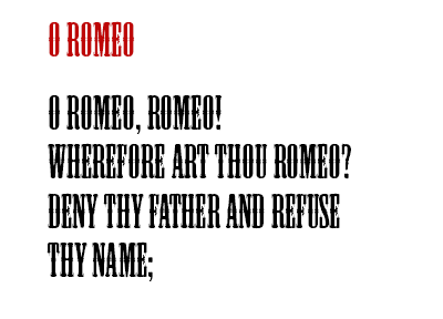
Another factor to examine is the quantity of type being set. This is especially evident when considering typefaces for display text. Setting a word or two in an ornate typeface might be okay (see Figure 3). While setting a sentence or two would be unconscionable. Body text works the same way. A typeface that might be appropriate for a paragraph of text, like Gill Sans Light, might be tiring to look at when reading an entire book.
 Figure 3: We can handle reading the top two words in the typeface Mesquite. But the bottom 14? Ouch.
Finally, analyze how you will use the type and make sure you have a sufficient range of weights and styles to accommodate the information you are typesetting. Next time, we’ll discuss some of the aesthetics to consider when combining type.
Leave a Reply
- Recent posts:
- Great Article from Typography.com
- New Trend: typefaces create their own matchmaking
- The New Archer Meets Its Match. Several of Them, Actually.
- Matching Typefaces to Logo Designs
- Becoming a Matchmaker: How to Combine Typefaces Effectively, part 3 of 3
- Becoming a Matchmaker: How to Combine Typefaces Effectively, part 2 of 3
- Becoming a Matchmaker: How to Combine Typefaces Effectively, part 1 of 3
- Post-Valentine’s Day Post
