Becoming a Matchmaker: How to Combine Typefaces Effectively, part 2 of 3
Note: This is the second in a three-part series about techniques for matching typefaces.
Aesthetics, or Does this serif make me look fat?
Now we turn to the less concrete world of aesthetics. In doing so, I hope to provide some solid advice and not hide behind flowery language and generalizations, like “help your Barbie® find her perfect Ken.®” The first thing to remember is that the goal of combining two typefaces together is to enhance visual hierarchy and/or interest by creating contrast. If you don’t want to create contrast, why not use the same typeface? So, how do you generate contrast? Here are a few methods that we’ll review:
- size
- weight
- color
- letterspacing
- case (upper vs. lower)
- serif vs. san serif vs. slab serif
- ornate vs. plain, formal vs. informal, organic vs. geometric
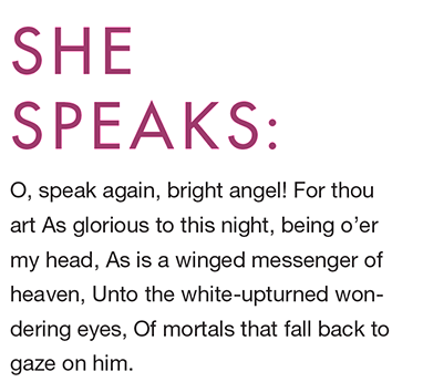
One obvious but effective way to form contrast is using size. Often this is a natural thing to do, because body text and display text differ by definition in size. This change in size helps the viewer understand that there is a difference between the heading and the body text. Accentuating that difference helps increase contrast. Another obvious method is weight. If your body text is light, choose a bolder weight of another typeface to enhance the contrast.
Body text is almost always lowercase. Try setting the display text in uppercase. Much of the time size, weight and case are used together to generate contrast. Letterspacing may also be adjusted in the display type to be more loose or tight than the body text. These 4 methods, along with changing the color of the type, are fairly common, easy to understand and can even be used to create contrast when using the same typeface for both body text and display text.
Finding a Match Made in Heaven May Involve Going through Hell
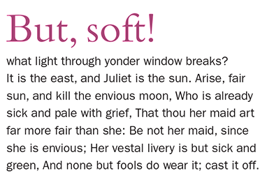
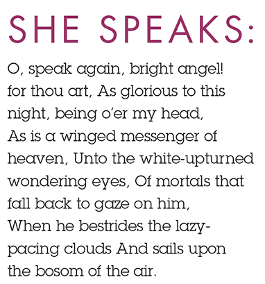
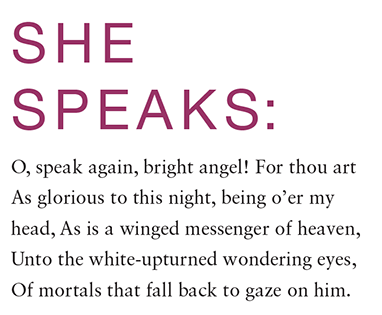
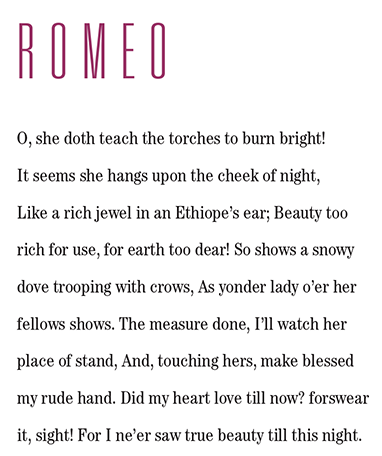
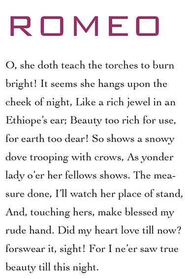
The next area of contrast involves the finishing strokes on letterforms: serifs, slab serifs and san serifs. Beginning typographers often find more success combining typefaces from different categories. This is because the contrast between the two typefaces has been integrated into the design of the type. Typefaces that are too similar don’t create enough contrast and have a poor aesthetic when paired. Just try combining Futura and Helvetica. Not only are they both san serifs, but they come from very different structural backgrounds. Futura is based on geometric shapes, including a perfect circle for many letters (b, c, d, e, o, etc.), while Helvetica’s geometry is based on a super ellipse (an elongated circle with straight sides). The result is two typefaces that look similar, with very subtle yet incompatible aesthetics (see Figure 1). Fruitfully combining a serif with a san serif is much easier. For instance, try using Franklin Gothic with Berkeley or Bembo (see Figure 2).
Figure 1. Futura and Helvetica need to start seeing other typefaces.
Figure 2. Bembo and Franklin seem compatible.
If you are trying to create a fairly modern aesthetic, try combining a san serif and a slab serif. Slabs have made a comeback in the last few years and continue to be a big presence in the typographic landscape. This is due, no doubt, to Robert Valentine’s use of the typeface designed by Hoefler Frere-Jones, Archer, in his design of Martha Stewart Living. A couple of other slab serifs that are oldies but goodies are ITC Lubalin Graph, which feels quite modern with its perfectly circled letter o, and Memphis. Then again, Lubalin was designed in the 1970s, so in typographic years, it is but a teenager. If you’re looking for a veritable toddler of a slab serif (and are tired of seeing Archer) try Museo Slab. Then again, maybe slab serifs are now so ubiquitous that they have become the new Helvetica. It’s like dating the prettiest girl in the office, or the most handsome guy: everyone wants to spend time with them.
Do Opposites Attract?
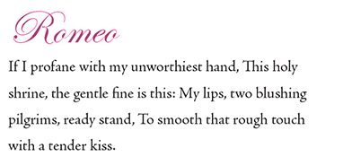
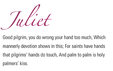
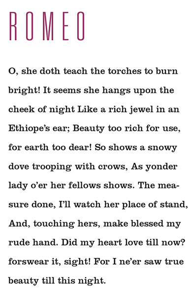
In romance, they say opposites attract. This may be true, as long as there is something the couple can agree on. Similarly, successfully matching typefaces involves finding two faces that have some opposing (though not altogether incompatible) aesthetics. Combining an ornate typeface with one that is more plain, formal with an informal typeface, an organic face with a geometric one. (Examples are shown in Figures 3–5.)
Figure 3. Edwardian Script (ornate) with Adobe Jenson (plain)
Figure 5. Trajan (formal) with Avenir (informal)
Figure 6. Zapfino (organic) with Univers condensed Light (geometric)
The trick in these combinations (as well as in the serif vs. san vs. slab discussion earlier) is to find typefaces that share some commonality. In other words we want to create contrast, but we also need a little harmony. Harmony can often be achieved by looking at the proportions and weights of the typefaces as well as the shape of the strokes and counterspaces. For instance, we’ve talked about Futura and its geometric appearance, including a perfect circle for an “o.” We also mentioned a similar characteristic in Lubalin Graph. These two qualities exist in many letters in both typefaces. They make a nice match when paired with each other (see Figure 7). We also mentioned the presence of an ellipse in Helvetica. Most serif typefaces use an ellipse or an oval as a base for the letters “o,” “b,” “d,” etc. Sabon, which also contains an ellipse, looks quite nice with Helvetica (see Figure 8). Two typefaces with a few similar finishing strokes are Bank Gothic and Cochin. Look a the “C,” “G,” “J,” and “S.” The ending strokes on the terminals are at a unique diagonal. Now examine the lower case Cochin letters “a,” “g” and “r” which have a similar ending stroke. Match the type together and you have a very interesting contrast of geometric with organic, but the strokes as well as the proportions of the capital letters are similar (very wide). These commonalities allow for a moderately compatible combination (shown in Figure 9).
Figure 7. Cute couple: Futura with Lubalin Graph
Figure 8. Helvetica and Sabon look good together.
Figure 9. Angled strokes for Bank Gothic and Cochin.
Get Stressed Out
Another characteristic to consider is the vertical stress of the type. If the typeface is slightly condensed, pair it with another that is either condensed or at least has a vertical emphasis. If we try to combine Univers Thin Ultra Condensed with a typeface like Clarendon, there are two issues: first, Clarendon is much heavier in weight than Univers and secondly Clarendon has a strong horizontal emphasis, which is the exact opposite of this weight and style of Univers. If we replace Clarendon with ITC Century Light Condensed, this matches much better because both the weights and vertical emphasis are similar (Figures 10, 11). Here’s another example of two typefaces with a horizontal emphasis. Take a look at Blackoak and Eurostile. Initially it may not seem that a wood cut typeface from the 19th century would match a Italian typeface from the 1950s. However, if you examine the horizontal proportions of both typefaces, you will find they are similar, making for an unexpected yet compatible combination (Figures 12, 13).
Figure 10. Univers Condensed Light with Clarendon Roman? Maybe.
Figure 11. Univers Condensed Light with Cheltenham Condensed Book? Yes.
Figure 12. Bank Gothic Light with Cochin Regular? The similarity of some of the finishing strokes helps them relate to each other. However, with such a large contrast in point size, those similarities are hardly noticeable. When both typefaces are at larger point sizes, they seem more compatible (see Figure 9).
Figure 13. Blackoak with Eurostile? Hmmm.In the final entry of this typographic trilogy, we’ll discuss ways to cultivate your own ability to match typefaces.
Leave a Reply
- Recent posts:
- Great Article from Typography.com
- New Trend: typefaces create their own matchmaking
- The New Archer Meets Its Match. Several of Them, Actually.
- Matching Typefaces to Logo Designs
- Becoming a Matchmaker: How to Combine Typefaces Effectively, part 3 of 3
- Becoming a Matchmaker: How to Combine Typefaces Effectively, part 2 of 3
- Becoming a Matchmaker: How to Combine Typefaces Effectively, part 1 of 3
- Post-Valentine’s Day Post
