Becoming a Matchmaker: How to Combine Typefaces Effectively, part 3 of 3
Note: This is the third entry in a three-part series about techniques for matching typefaces.
Getting your own groove on
From the previous posts, you’ve been given a lot of suggestions and characteristics to consider. In romance, this can often lead to what is commonly called analysis paralysis: you end up doing nothing. To get yourself over the fear and into the typographic matching-making game, try this five-step process: Emulate, Investigate, Analyze, Experiment, Solicit feedback. It works for your love life, will it work for type? Yes.
Emulate
Start combining typefaces by looking at successful combinations that others have found. Pick up a design magazine or a design annual, log on to a web site that showcases design and examine the typefaces that have been used together. Set some type with these same (or similar) combinations.
Investigate
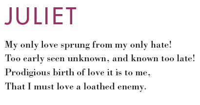
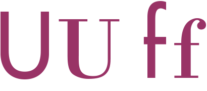
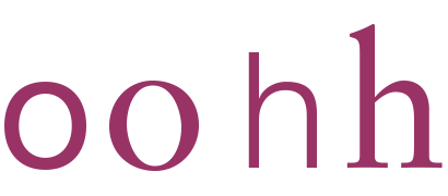
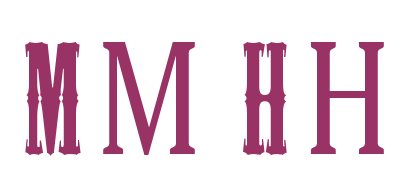
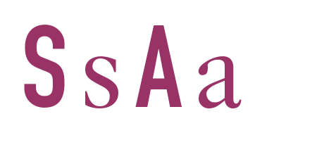
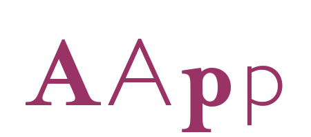
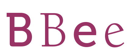
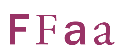
Once you are comfortable (or bored), start looking more closely at some of your favorite typefaces. Set something in the typeface, blow it up large on the computer or print out the alphabet at a large point size (72 points or above). Study the stress of the letters, the brackets on the serifs, the finishing strokes on the terminals, the proportions, etc. (See figures below). During this phase you start to become more aware of the characteristics of typefaces.
Analyze & Experiment
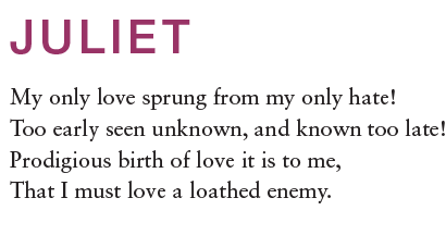
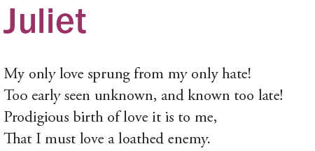
Finally, start comparing and analyzing other aspects of the typefaces. Look at the proportions, the size and shape of the serifs, the different moods or feel that the typefaces have. You could even examine their origins and history. Begin setting a phrase or two in each typeface and playing with them. How do they look together? Experiment with different sizes, weights and styles. Print them out. Look at them and analyze the similarities and differences. Decide if they are compatible. You will begin to find some unexpected yet compatible combinations. (See below for some couples that seem to work.)
Solicit Feedback
Once you have some combinations that you feel good about, it doesn’t hurt to ask a trusted designer friend for some feedback, either in person or in an online forum. Be careful who you ask, or your Aunt Betty may give you more advice for your typographic love life than you wish. And remember that sometimes you just need to go with your heart (ah, so romantic). With some study, hard work and trial and error, you can start combining type in ways that make sense and work well to enhance your designs and make them more unique. If you’re lucky, you may just find the Gwyneth Paltrow and Chris Martin of typography. Oops, I mean the Tom Hanks and Rita Wilson of typography. But be careful: no one wants to be known for hooking up Chris Brown with Rihanna.
10 Type Combinations that seem to work
Two old lovers:
Futura & Bodoni
Similar proportions:
Helvetica & Sabon
Common geometry:
Eurostile Demi & ITC Century Roman
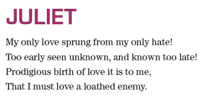
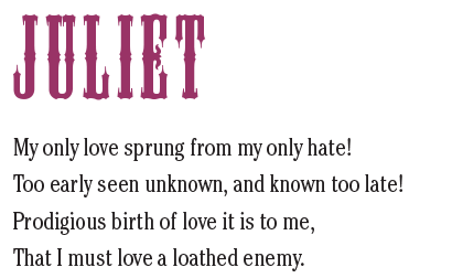
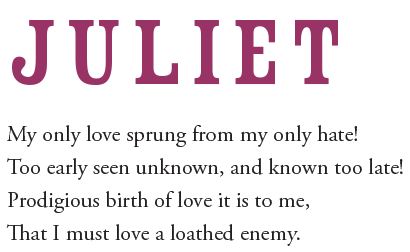
The odd couple (plain vs. fancy):
Mesquite & Cheltenham Light Condensed
A well-worn romance:
Rosewood Std Fill & Adobe Garamond
Germany + England = Harmony:
DIN 1451 Engschrift and Caslon 540
An old English romance:
Mrs Eaves Bold & Gill Sans Light
Two faces with a bit of funk:
Museo 500 & ITC Berkeley Old Style Book
A beautifully aging couple:
ITC Franklin Gothic Std Medium and Adobe Garamond Pro
One Response
Leave a Reply
- Recent posts:
- Great Article from Typography.com
- New Trend: typefaces create their own matchmaking
- The New Archer Meets Its Match. Several of Them, Actually.
- Matching Typefaces to Logo Designs
- Becoming a Matchmaker: How to Combine Typefaces Effectively, part 3 of 3
- Becoming a Matchmaker: How to Combine Typefaces Effectively, part 2 of 3
- Becoming a Matchmaker: How to Combine Typefaces Effectively, part 1 of 3
- Post-Valentine’s Day Post





[…] Go to Part 3 of 3 […]