Bi-Weekly Comb: Futura + a few typefaces
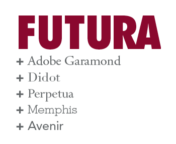
My latest entry on jimgodfreydesign.com talks about the recent resurgence of Futura Extra Bold Condensed in Nike’s advertising and product lines. In conjunction with that, I thought it would be interesting to look at some typefaces that work well with Futura.
I have never liked Futura when used as body text. Its long ascenders and descenders require additional leading, which is often not convenient for longer texts. And I don’t find it particularly readable. With a nod to Nike, I would say “Just don’t do it.”
Fortunately, there’s a fairly good-sized list of compatible serifs. An obvious one is Garamond, which, as we’ve discussed before, goes with just about anything. Nike used to pair Futura with Palatino in the 1980s and 1990s. Some other serifs that look good with Futura are Didot, Bodoni, Perpetua, Mercury. I think one of the best combinations with Futura is a very geometric slab serif, Memphis. Designed just two years after Futura debuted in 1927, it was also designed in Germany (for the Stempel foundry).
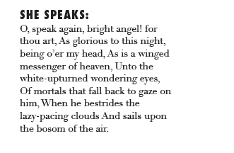
Futura + Adobe Garamond:
Futura + Didot:
Futura + Perpetua:
Futura + Memphis:
Finally, as a san serif substitute for body text for Futura, try using Avenir. The letter O and other letters are nearly based on a circle, so at small point sizes, they look similar to Futura. Avenir is also much more readable.
Futura + Avenir:
For a few more ideas, consult the Type Matrix. The great thing about Futura is that it is a wonderful foil for a number of typefaces.
A special thank you to Bill Shakespeare for the text.
One Response
Leave a Reply
- Recent posts:
- Great Article from Typography.com
- New Trend: typefaces create their own matchmaking
- The New Archer Meets Its Match. Several of Them, Actually.
- Matching Typefaces to Logo Designs
- Becoming a Matchmaker: How to Combine Typefaces Effectively, part 3 of 3
- Becoming a Matchmaker: How to Combine Typefaces Effectively, part 2 of 3
- Becoming a Matchmaker: How to Combine Typefaces Effectively, part 1 of 3
- Post-Valentine’s Day Post


Oral Creampie Cumpilation