Bi-weekly Combo: Squirrel with some san serifs
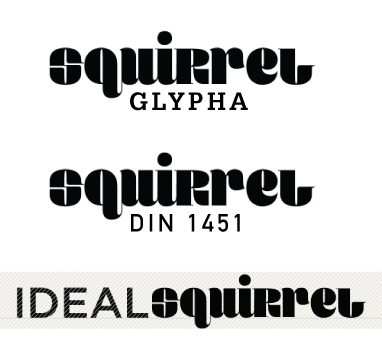
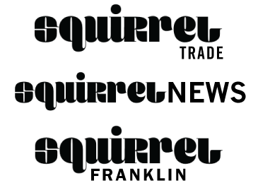
Although I’m not sure I understand the rationale behind its name, I love the curves of Squirrel and the fact that the uppercase is the same size as the x-height. It shares a kinship with typefaces like Bodoni Poster and is a beautiful typeface. What is a good match for it? Anything straight. Try something with the last name of gothic: Franklin, Trade, News. Those all provide a nice sturdy foil. I also thought a slab serif would compliment it nicely, but after giving it a test drive with Glypha, there is something that doesn’t look quite right. Another set of san serifs that compliments Squirrel quite nicely is the DIN family and the Gotham family. The proportions of Gotham seem to more closely match that of Squirrel, making it a beautiful match.

Want to be daring? Try it with the blackletter typeface Cabazon. I don’t know that it’s a slam dunk, but it sure looks interesting.
About the fonts:
Squirrel was just released this year from fontyou.com. I found it on fontshop.com.
Cabazon is also on that web site, designed by Jim Parkinson.
Adobe sells the Gothics (you’ll find them elsewhere, too).
Adobe also has some DINs.
Gotham is found on typography.com.
Leave a Reply
- Recent posts:
- Great Article from Typography.com
- New Trend: typefaces create their own matchmaking
- The New Archer Meets Its Match. Several of Them, Actually.
- Matching Typefaces to Logo Designs
- Becoming a Matchmaker: How to Combine Typefaces Effectively, part 3 of 3
- Becoming a Matchmaker: How to Combine Typefaces Effectively, part 2 of 3
- Becoming a Matchmaker: How to Combine Typefaces Effectively, part 1 of 3
- Post-Valentine’s Day Post

