Holiday Type, part 1 of 3
Part 1 of 3
The Holiday season brings out some great typography. Two important things that I think about in choosing type is finding something that feels elegant and that has a slight ornateness to it (or sometimes I create that ornateness). Contrast that with something plain and you’ve probably got a type combination that works.
Detailed Elegance
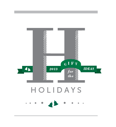
For something simple and elegant try Bodoni with Museo Sans (as shown above). The H in Bodoni has the beautiful contrast of a heavy stroke with a very light serif. I also added the diagonal white lines to the H give it some dimension and detail. Museo Sans is a plain geometric san serif that provides a simple contrast to the details. I’ve also designed some holiday bells and added some stripes to the ribbon to make it more interesting. The curves on the ribbon are fairly geometric to match both Bodoni and Museo Sans. The end result is something that is more unique because of the details in the H and the festive ribbon and bells.
Happy Holidays.
Leave a Reply
- Recent posts:
- Great Article from Typography.com
- New Trend: typefaces create their own matchmaking
- The New Archer Meets Its Match. Several of Them, Actually.
- Matching Typefaces to Logo Designs
- Becoming a Matchmaker: How to Combine Typefaces Effectively, part 3 of 3
- Becoming a Matchmaker: How to Combine Typefaces Effectively, part 2 of 3
- Becoming a Matchmaker: How to Combine Typefaces Effectively, part 1 of 3
- Post-Valentine’s Day Post
