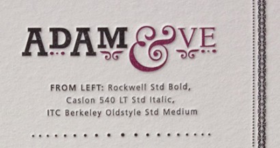
Poster Details: Adam & Eve
Rockwell + Caslon 540 + Berkeley
[ Rockwell Std Bold + Caslon 540 LT Std Italic + ITC Berkeley Oldstyle Std Medium ]
In many religions, Adam and Eve are honored as our first parents. Imagine trying to trace your posterity back to them. What an interesting family tree that would make. It is only fitting, then, that two of the typefaces used to depict Adam and Eve, Rockwell and Berkeley, have interesting pedigrees of their own.
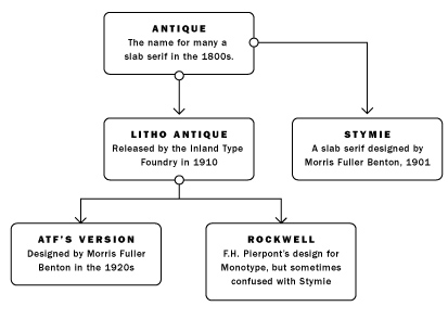
Rockwell springs from slab serif typefaces from the 1800s, often labeled “Antique” or “Egyptian.” Many were cut out of wood at large sizes to facilitate use on Posters. In 1910 the Inland Type Foundry cast Litho Antique in metal. In the 1920s, Morris Fuller Benton gave birth to a revival of the typeface for American Type Founders (ATF). That was followed by Montotype releasing its version, which was designed by F.H. Pierpont in 1934. Some publications erroneously refer to it as Stymie Bold, which was actually a slab serif typeface Morris Fuller Benton begat in 1901. (See Figure 1.)
Figure 1.
ITC Berkeley also has an interesting family history. The University of California Press (at Berkeley) commissioned Frederic Goudy to design a typeface for their use. He created University of California Old Style in 1938. While designing the typeface, his workshop burned down in a fire, but fortunately he had already sent the master patterns to Monotype. They cut the type and it was well-used by the press. In 1959, Lanston Monotype released the typeface for public use, christening it Californian, although it was seldom used. In 1983, the International Typeface Corporation (ITC) rediscovered the face and created its own version. It was not an exact copy of Californian, as its designer, Tony Stan, incorporated elements of three of Californian’s older cousins: Kennerley, Goudy Oldstyle, and Deepdene. (See Figure 2.)
Figure 2.
The things I love about Berkeley are the subtle quirks of the letterforms (look at the lowercase e, the upper and lowercase x and the lowercase K). It is a beautiful face, light and open, providing a contrast to the sturdy strokes and slab serifs in Rockwell (I love the crossbar at the top of the A). The italic ampersand from Caslon 540 is stunning and forms a nice visual pun with the E in Eve. The American Type Founders released Caslon 540 in 1902, a descendant of William Caslon’s typefaces from the 1700s.
We may all be descendants of Adam and Eve, but some family trees prove more interesting than others.
Sources:
Twentieth Century Type Designers by Sebastian Carter, New Edition (1995), published by W.W. Norton & Company, New York and London.
One Response
Leave a Reply
- Recent posts:
- Great Article from Typography.com
- New Trend: typefaces create their own matchmaking
- The New Archer Meets Its Match. Several of Them, Actually.
- Matching Typefaces to Logo Designs
- Becoming a Matchmaker: How to Combine Typefaces Effectively, part 3 of 3
- Becoming a Matchmaker: How to Combine Typefaces Effectively, part 2 of 3
- Becoming a Matchmaker: How to Combine Typefaces Effectively, part 1 of 3
- Post-Valentine’s Day Post


We may all be descendants of Adam and Eve, but some family trees prove more interesting than others.