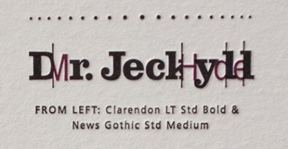
Poster Details: Dr. Jeckyll and Mr. Hyde
Clarendon + News Gothic
[ Clarendon LT Std Bold, News Gothic Std Medium ]
Mr. Utterson had his suspicions about Dr. Jeckyll, his somewhat reclusive friend in London. The typeface Clarendon works well to
depict the doctor. Designed in England, it is a meshing of a slab serif and a serif (not unlike Dr. Jeckyll and the two sides of his
personality) that was created by the Fann Street Foundry in 1845. The result is a very readable design that has been used for display text and body text for over 160 years. It is bold and quite legible.
Lurking behind Dr. Jeckyll are bits and pieces of the repulsive Mr. Hyde, set in News Gothic. This san serif was designed by Morris Fuller Benton in America in 1908 (I assume from the name of the typeface that it was promoted for use in newspapers). Some may ask why a distinctive, hideous typeface was not used to depict Mr. Hyde. I wanted something more subtle, so the color red has been used to symbolize Hyde as the embodiment of evil (instead of using a strange typeface).
Why do the typefaces work well together? They both use very clean and traditional shapes for the letterforms. The thick slab-like serif plays well against the clean san serif type. The different weights provide a nice contrast, too, and make it easy for Mr. Hyde to lurk behind Dr. Jeckyll.
Other typefaces similar to Clarendon:
The Centuries: Century, Century Old Style, Century Schoolbook, New Century Schoolbook; Sentinel, Corona, Cheltenham, Impressum, Ziggurat
Typefaces similar to News Gothic:
Champion Gothic, Benton Sans, Franklin Gothic Condensed, Trade Gothic, Whitney, Scout
Try mixing typefaces from each of the lists above.
Sources:
I read the book (don’t look so surprised)
adobe.com (Clarendon, News Gothic)
Leave a Reply
- Recent posts:
- Great Article from Typography.com
- New Trend: typefaces create their own matchmaking
- The New Archer Meets Its Match. Several of Them, Actually.
- Matching Typefaces to Logo Designs
- Becoming a Matchmaker: How to Combine Typefaces Effectively, part 3 of 3
- Becoming a Matchmaker: How to Combine Typefaces Effectively, part 2 of 3
- Becoming a Matchmaker: How to Combine Typefaces Effectively, part 1 of 3
- Post-Valentine’s Day Post
