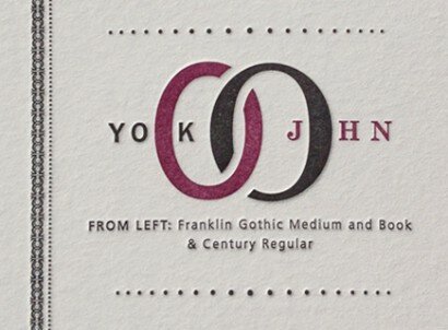
Poster Details: John and Yoko
Franklin Gothic + Century
[ from left: Franklin Gothic Medium, Book + Century Regular ]
Yoko and John. John and Yoko. These names will be connected forever, whether you think she was responsible for breaking up the Beatles or not. They are a couple known for their passion, love and devotion to one another. To me, linking the two letter “O”s together not only seemed to bring to mind their amazing connection to each other, but kind of reminded me of a typographic counterpart to Annie Leibovitz’s famous photograph of John and Yoko. Typographically, no one can question the passion, love and devotion that Morris Fuller Benton had for typography. Working for the American Type Foundry (which his father helped found), the legacy of the typefaces he designed from the early 1900s until his death in 1948 is unparalleled. He truly helped put American typeface design on the map with his refined, legible and versatile typefaces. How fitting, then, to combine arguably his most famous san serif, Franklin Gothic, with his most famous serif, Century. Franklin was designed first, in 1902, and has been a staple in design for more than a hundred years. The legible and humanistic forms took their cues from some of the san serifs of the 1800s. Century was designed from 1908 to 1909, based in part on the designs his father, Linn Boyd Benton, created for Century magazine, commissioned in the 1890s by Theodore Lowe DeVinne. I guess the one irony of this type combination is that Yoko and John were controversial and flamboyant in the 1960s and early 1970s, (see this clip from the Dick Cavett show) and these typefaces are reserved and quiet. But maybe that creates a nice contrast.
Where can I purchase these typefaces?
Franklin Gothic: Adobe.com, fonts.com (The ITC version is a super family with 48 different weights and styles, designed specifically for the digital age), linotype.com.
Century: Can be found at Adobe.com, fonts.com, linotype.com
Any newer san serifs?
For a couple of more modern san serifs that are legible and have an element of humanism (as opposed to being geometric), try Gotham and Knockout both from Hoefler & Frere-Jones. Another is Benton Sans (designed as an extension of News Gothic) from fontbureau.com.
Any other legible serifs?
The New: Sentinel (another new typeface from H&FJ), Miller (designed in 1997 by Matthew Carter) and Georgia Pro (new weights and styles by Steve Matteson) from fontbureau.com
The Old: Clarendon (a 19th century pre-cursor to Century), Times New Roman (all over the internet, which unfortunately has taken a nice typeface from Stanley Morrison and made it too commonplace to use).
Leave a Reply
- Recent posts:
- Great Article from Typography.com
- New Trend: typefaces create their own matchmaking
- The New Archer Meets Its Match. Several of Them, Actually.
- Matching Typefaces to Logo Designs
- Becoming a Matchmaker: How to Combine Typefaces Effectively, part 3 of 3
- Becoming a Matchmaker: How to Combine Typefaces Effectively, part 2 of 3
- Becoming a Matchmaker: How to Combine Typefaces Effectively, part 1 of 3
- Post-Valentine’s Day Post
