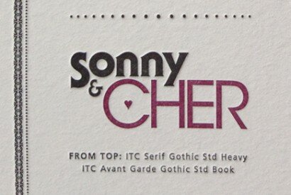
Poster Details: Sonny and Cher
ITC Serif Gothic + ITC Avant Garde Gothic
[ from top: ITC Serif Gothic Std Heavy + ITC Avant Garde Gothic Std Book ]
The songs, the long hair, the bell bottom pants. Sonny and Cher met in 1963 when Cher was about 17 and Sonny was 10 years older. He had been writing pop songs and weaving his way through the music industry in Los Angeles for almost a decade. They began singing together as Caesar and Cleo, but hit the big time in 1965 as Sonny and Cher when Sonny wrote I Got You Babe. I think the first song I remember hearing them sing on the radio was Gypsy’s, Tramps and Thieves. Their popularity as a couple peaked in the 1970s with their television show, which I can vaguely remember watching. They alternated between being funny, corny, and, at least in Cher’s case, elegant.
What Sonny and Cher were to 1970s television and entertainment, Avant Garde and Serif Gothic were to 1970s typography. I cannot think of a typeface that epitomizes the ’70s quite like Avante Garde Gothic. Herb Lubalin designed the letterforms for the masthead of the magazine Avant Garde, for which he was the art director. If you’ve never heard of Herb, look him up. Using photo typesetting, he began the trend of kerning letters more tightly (often so tight that they overlapped). In addition, he was one of the founders of the International Typeface Corporation (ITC) in 1970. He began U&lc, ITC’s magazine to promote its typefaces, which was extremely popular in the design industry in the 1970s and early 1980s. Together with Tom Carnase, Herb took his masthead and created Avant Garde with 5 weights/styles and some unique ligatures. Because if its popularity, the type family soon grew to include many more styles and weights.
Serif Gothic was designed by Herb and Tony DiSpigna in 1974. The lowercase letters a, b, d, g, p, q are all quite unique, as are the capital letters B, K, R, S. The subtle serifs remind me of Copperplate Gothic. The bold, chunky letterforms from Serif provide a nice contrast to the thin, willowy Avant Garde. It’s almost like you can hear Serif Gothic crooning to Avant Garde “Babe, I got you babe…”
Where to buy the typefaces:
Adobe.com, ITCfonts.com, myfonts.com; there are many other web sites that sell them, too.
Other typefaces from the same designers:
Herb Lubalin – ITC Lubalin Graph (a beautiful slab serif), ITC Busorama (collaborating again with Tom), ITC Ronda. For more on Herb here are two articles, one by Stephen Heller and the other from aiga.org
Tony DiSpigna – Korinna (another ’70s staple) and Korinna Kursiv. His web site indicates that thickstroke.com will be releasing 4 more of his typefaces, including DiSpigna Roman (a beautiful take on Bodoni). For some of Tony’s hand-lettering, check out this article from Imprint.com (scroll down about half-way to see Tony’s work).
Leave a Reply
- Recent posts:
- Great Article from Typography.com
- New Trend: typefaces create their own matchmaking
- The New Archer Meets Its Match. Several of Them, Actually.
- Matching Typefaces to Logo Designs
- Becoming a Matchmaker: How to Combine Typefaces Effectively, part 3 of 3
- Becoming a Matchmaker: How to Combine Typefaces Effectively, part 2 of 3
- Becoming a Matchmaker: How to Combine Typefaces Effectively, part 1 of 3
- Post-Valentine’s Day Post
