The Making of the Poster, part 3

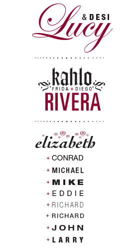
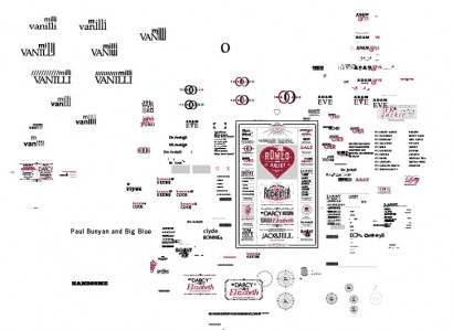
The road to success is littered with rejection. At least, that’s how I feel about the Typographic Matchmaking poster. There were more than a few ideas and designs that were discarded completely. Others that were revised, revised and then discarded. And some that were revised, polished, tweaked and lived to see the light of day. Above are some of the better designs that did not make it. I especially liked Diego and Frida, but I was not sure how recognizable they would be to those outside of the Arts. When I was working on the poster, Elizabeth Taylor had recently died and my wife felt it would not be in good taste to include her and her husbands. Below is a shot of my file in Illustrator, with different versions of combinations discarded around the pasteboard. It kind of looks like a typographic junk yard.
Leave a Reply
- Recent posts:
- Great Article from Typography.com
- New Trend: typefaces create their own matchmaking
- The New Archer Meets Its Match. Several of Them, Actually.
- Matching Typefaces to Logo Designs
- Becoming a Matchmaker: How to Combine Typefaces Effectively, part 3 of 3
- Becoming a Matchmaker: How to Combine Typefaces Effectively, part 2 of 3
- Becoming a Matchmaker: How to Combine Typefaces Effectively, part 1 of 3
- Post-Valentine’s Day Post
