Weekly Comb: Type Matrix No. 3
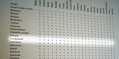
A few years ago, I wrote an essay titled “Garamond, the Ketchup of Typefaces.” I argued that Garamond is a match with just about every typeface. In dating terms, that is sometimes called “playing the field.” In this final entry of examining U&lc’s Type Matrix, I thought I’d take a look at Garamond as the text type.
The chart has 10 combinations that are marked as “Not a conservative choice (2),” 11 marked as “Combine at will (1)” and only 1 that says “Think again (3).” Let’s start by looking at the one and only “Think again”: Garamond with Bembo.
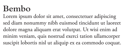
B E M B O & G A R A M O N D
Now admittedly, the chart does not mention the version of Garamond to which it refers. I assume, since it appeared in U&lc, that the authors probably were looking at ITC Garamond. U&lc was published by the International Typeface Corporation (ITC). To me, ITC Garamond is a truly ugly, homogenized version of Garamond that fits squarely in the 1970s to mid-1980s. I am not alone in this opinion. For an in-depth view of its depravity, read Michael Bierut’s “I Hate ITC Garamond.” In my examples below, I used Adobe Garamond, which is my favorite version. I agree that Garamond and Bembo don’t work together, they’re too similar.
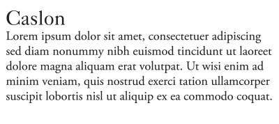
C A S L O N & G A R A M O N D
I would also argue that Garamond and Caslon are not good for each other either, for the same reason. I would give those a “Think again (3).”
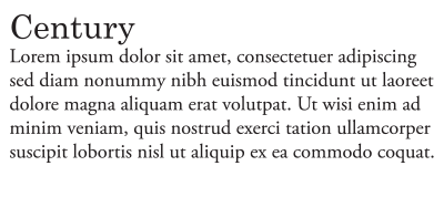
C E N T U R Y & G A R A M O N D
Century and Garamond appear uneasy together, so “Not a conservative choice (2)” feels appropriate. I think this is also the case for the other serif typefaces on the chart.
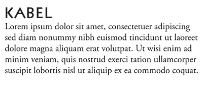
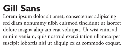
S A N S E R I F S & G A R A M O N D
All of the san serif faces seem to work quite well with Garamond, although Gill Sans may be slightly suspect.
All things considered, I think Garamond is a “player,” as long as it’s going out with san serif typefaces.
Leave a Reply
- Recent posts:
- Great Article from Typography.com
- New Trend: typefaces create their own matchmaking
- The New Archer Meets Its Match. Several of Them, Actually.
- Matching Typefaces to Logo Designs
- Becoming a Matchmaker: How to Combine Typefaces Effectively, part 3 of 3
- Becoming a Matchmaker: How to Combine Typefaces Effectively, part 2 of 3
- Becoming a Matchmaker: How to Combine Typefaces Effectively, part 1 of 3
- Post-Valentine’s Day Post
