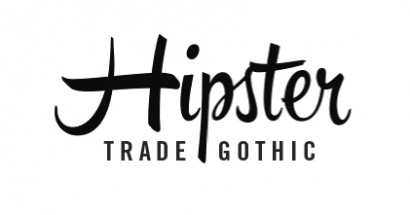
Weekly Combo: Hipster + Trade Gothic
Hipster Script Pro and Trade Gothic
For combining typefaces, taking a face with a lot of character and putting next to a face that is non-descript almost always works. It is the visual equivalent of Chris Farley acting with David Spade.
I’m not necessarily a big fan of script type. Most of it looks stilted and forced. This is partially because the letterforms don’t join together quite the way they would if they were hand written. Another reason is that if we write by hand, no two letterforms are quite the same. However, there a few scripts that seem to look natural, one of which is Hipster Script Pro. It looks like a modern take on hand-painted signs from the ’50s and ’60s. Many alternate characters have been designed to facilitate natural-looking letter combinations and to create multiple versions of the each letter, creating the illusion of handwriting.
Trade Gothic is a no nonsense condensed typeface that becomes the perfect Stanley Laurel to Hipster’s Oliver Hardy. I’ve always liked Trade Gothic, which I think has a little more character than the condensed and compressed styles of Helvetica.
Hipster was designed by Alejandro Paul in 2012. Jackson Burke designed Trade Gothic in 1948. A new version of Trade Gothic was released in 2008 called Trade Gothic Next.
Leave a Reply
- Recent posts:
- Great Article from Typography.com
- New Trend: typefaces create their own matchmaking
- The New Archer Meets Its Match. Several of Them, Actually.
- Matching Typefaces to Logo Designs
- Becoming a Matchmaker: How to Combine Typefaces Effectively, part 3 of 3
- Becoming a Matchmaker: How to Combine Typefaces Effectively, part 2 of 3
- Becoming a Matchmaker: How to Combine Typefaces Effectively, part 1 of 3
- Post-Valentine’s Day Post
