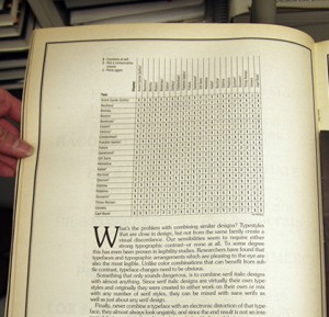
Weekly Combo: Type Matrix No. 1:
In 1992, the famous periodical U&lc was past its prime. It did, however, create an intriguing tool for matching typefaces, known as the type matrix. I’ve highlighted this source on my resources page. The type matrix compared display text and body text and indicated a 1 (Combine at Will), 2 (Not a Conservative Choice), or 3 (Think Again) to indicate which pairs were most compatible. For the next few weeks, I’ll pick a few of the combinations and analyze them. I’m also working on a new version of the chart with some contemporary typefaces. Not sure when that will be completed, but look for it this summer.
Leave a Reply
- Recent posts:
- Great Article from Typography.com
- New Trend: typefaces create their own matchmaking
- The New Archer Meets Its Match. Several of Them, Actually.
- Matching Typefaces to Logo Designs
- Becoming a Matchmaker: How to Combine Typefaces Effectively, part 3 of 3
- Becoming a Matchmaker: How to Combine Typefaces Effectively, part 2 of 3
- Becoming a Matchmaker: How to Combine Typefaces Effectively, part 1 of 3
- Post-Valentine’s Day Post
